Stop Leaving Money on the Table: 8 Tips for Creating Magnetic Calls to Action
September 6, 2024
Lindsey eryn
Let’s talk about something important: how much money are you leaving on the table because your website is missing a clear call to action (CTA)? If you’re not guiding your visitors to the next step, you’re losing out on bookings, sales, and real connections.
But here’s the secret: a CTA doesn’t have to feel stiff, salesy, or awkward. In fact, it should feel more like an invitation to create something magical together.
Here’s how you can level up your CTAs and turn website clicks into conversions:
01 // Be Clear & Direct
Don’t make them guess what to do next. Use straightforward, action-oriented language like “Book Now,” “Shop the Collection,” or “Download Your Free Guide.” Clarity is key—your audience should never feel confused about the next step.
02 // Tap Into Emotion
Focus on how your audience will feel after taking action. Use words that evoke excitement, accomplishment, or empowerment. Phrases like “create magic” or “unlock potential” speak to emotions, not just facts.
03 // Make It Stand Out
Your CTA should grab attention. Use bold fonts, contrasting colors, or strategic placement to make sure it stands out on the page. You don’t want your CTA to blend into the background—it should be unmissable.
04 // Speak to Their Aspirations
Think about what your audience truly desires—whether it’s growth, creativity, or success. Frame your CTA around helping them reach those goals. For example, “Let’s make your brand unforgettable” sounds way more inspiring than a simple “click here.”
05 // Be Conversational
Write as if you’re speaking to a friend. Keep the tone personal and relatable. No one likes corporate-speak, so use warm and inviting language like “let’s work together” or “we’re in this with you.”
06 // Use Imagery & Metaphors
Words like “build your dream” or “turn your vision into reality” paint a vivid picture. Using metaphors makes your CTA stand out and sparks the imagination, giving your audience a clear, emotional reason to click.
07 // Create Urgency
A little urgency can go a long way. Add phrases like “Limited Time Offer” or “Only 24 Hours Left” to encourage immediate action without feeling too pushy.
08 // Keep It Simple
Avoid overwhelming your audience with too many CTAs at once. Stick to one clear action per page or section to maintain focus and guide them smoothly to the next step.
Your call to action should feel like more than just a button—it’s a moment to connect with your audience, guide them towards taking action, and show them the value of what you offer. When you get it right, the results speak for themselves.
Ready to Turn Your Website into a Conversion Machine?
If you’re ready to upgrade your website’s CTAs and make it work for you, it’s time to add that magic touch.
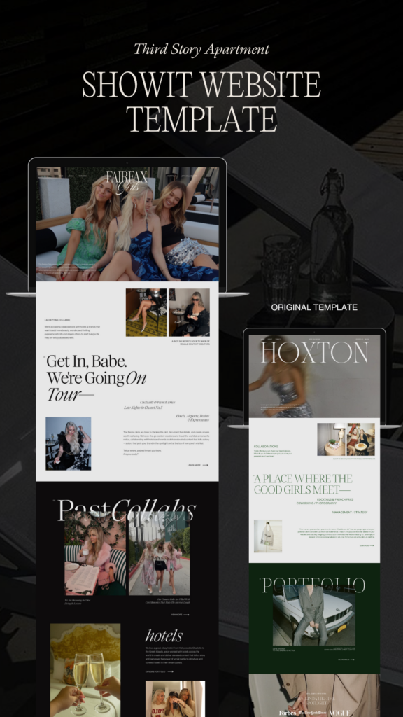
My website templates at The Third Story Apartment are designed with powerful CTAs baked in to help you convert visitors into loyal clients. They’re easy to use, customizable, and will give your website the glow-up it deserves—without breaking the bank.
Make your move today! Shop now and get your hands on a template that will help you start creating your magic. ✨
Let’s make something unforgettable!
xx Lindsey Eryn
Lindsey eryn
September 6, 2024
"Gang, hire this girl.
She took my brain and
Made It Into A Visual Masterpiece!"
"Lindsey is the artist behind the website and all the design work for my brand. but, more importantly, she was the voice that jumped on a phone call with me and said 'you're the magic, linds. it's you.' and that call changed it all."
from lindsey plevyak
work with me
send
inquiry
follow us at @thirdstoryapt
XX LINDSEY ERYN
site design by third story apartment |
Home
Contact
Hire us
shop templates
for the daring romantics, dreamers, and magic makers— the ordinary people who dare to do extraordinary things. our mission is to help you launch your dream website so you can create meaningful work and fulfill your purpose.

